2.3 KiB
Druid components
Button
Basic Druid input component
- Button callback have next params: (self, params, button_instance)
- self - Druid self context
- params - Additional params, specified on button creating
- button_instance - button itself
- Button have next events:
- on_click - basic button callback
- on_repeated_click - repeated click callback, while holding the button, don't trigger if callback is empty
- on_long_click - callback on long button tap, don't trigger if callback is empty
- on_hold_click - hold callback, before long_click trigger, don't trigger if callback is empty
- on_double_click - different callback, if tap button 2+ in row, don't trigger if callback is empty
- If you have stencil on buttons and you don't want trigger them outside of stencil node, you can use
button:set_click_zoneto restrict button click zone - Button can have key trigger to use then by key:
button:set_key_trigger
Text
Basic Druid text component
- Text component by default have auto adjust text sizing. Text never will be more, than text size, which you can setup in gui scene. It can be disabled on component creating
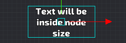
- Text pivot can be changed with
text:set_pivot, and text will save their position inside their text size box:
Blocker
Druid component for block input
It can be used for block input in special zone.
Example:
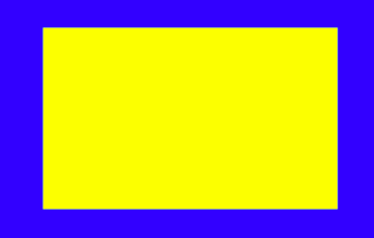
Blue zone is button with close_window callback
Yellow zone is blocker with window content
So you can do the safe zones, when you have the big buttons
Back Handler
Component to handle back button
It works on Android back button and Backspace. Key triggers in input.binding should be setup
Lang text
Wrap on Text component to handle localization
Scroll
Basic Druid scroll component
Progress
Basic Druid progress bar component
Slider
Basic Druid slider component
Input
Basic Druid text input component (unimplemented)
Checkbox
Basic Druid checkbox component
Checkbox group
Several checkboxes in one group
Radio group
Several checkboxes in one group with single choice
Timer
Handle timer work on gui text node
Grid
Component for manage node positions
Hover
System Druid component, handle hover node state