9.3 KiB
Druid components
Button
Overview
Basic Druid input component. Handle input on node and provide different callbacks on touch events.
Setup
Create button with druid: button = druid:new_button(node_name, callback, [params], [animation_node])
Where node name is name of node from GUI scene. You can use node_name as input trigger zone and point another node for animation via animation_node
Notes
- Button callback have next params: (self, params, button_instance)
- self - Druid self context
- params - Additional params, specified on button creating
- button_instance - button itself
- You can set params on button callback on button creating:
druid:new_button("node_name", callback, params). This params will pass in callback as second argument - Button have next events:
- on_click - basic button callback
- on_repeated_click - repeated click callback, while holding the button, don't trigger if callback is empty
- on_long_click - callback on long button tap, don't trigger if callback is empty
- on_hold_click - hold callback, before long_click trigger, don't trigger if callback is empty
- on_double_click - different callback, if tap button 2+ in row, don't trigger if callback is empty
- If you have stencil on buttons and you don't want trigger them outside of stencil node, you can use
button:set_click_zoneto restrict button click zone - Button can have key trigger to use then by key:
button:set_key_trigger - Animation node can be used for example to animate small icon on big panel. Node name of trigger zone will be
big paneland animation node will besmall icon
Text
Overview
Basic Druid text component. Text components by default have the text size adjusting.
Setup
Create text node with druid: text = druid:new_text(node_name, [initial_value])
Notes
- Text component by default have auto adjust text sizing. Text never will be bigger, than text node size, which you can setup in GUI scene. It can be disabled on component creating by settings argument
is_no_adjustto true
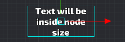
- Text pivot can be changed with
text:set_pivot, and text will save their position inside their text size box:
Blocker
Overview
Druid component for block input. Use it to block input in special zone.
Setup
Create blocker component with druid: druid:new_blocker(node_name)
Notes
Explanation:
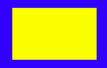
Blue zone is button with close_window callback
Yellow zone is blocker with window content
So you can do the safe zones, when you have the big buttons
Back Handler
Overview
Component to handle back button. It handle Android back button and Backspace key. Key triggers in input.binding should be setup for correct working.
Setup
Setup callback with druid:new_back_handler(callback)
Notes
Lang text
Overview
Wrap on Text component to handle localization. It uses druid get_text_function to set text by it's id
Setup
Create lang text component with druid text = druid:new_lang_text(node_name, locale_id)
Notes
Scroll
Overview
Basic Druid scroll component. Handle all scrolling stuff in druid GUI
Setup
Create scroll component with druid: scroll = druid:new_scroll(scroll_parent, scroll_input).
Scroll parent - is dynamic part. This node will change position by scroll system
Scroll input - is static part. It capturing user input and recognize scrolling touches
Initial scroll size will be equal to scroll parent node size. The initial view box will be equal to scroll input node size
Usually, Place static input zone part, and as children add scroll parent part:
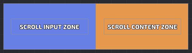
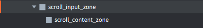
Here scroll_content_zone below input zone, in game content zone be able to scroll left until end
Notes
- Scroll by default style have inertion and "back moving". It can be adjust via scroll style settings
- You can setup "points of interest". Scroll always will be centered on closes point of interest. It is able to create slider without inertion and points of interest on each scroll element.
- Scroll have next events:
- on_scroll On scroll move callback
- on_scroll_to On scroll_to function callback
- on_point_scroll On scroll_to_index function callback
- You can adjust scroll content size by
scroll:set_border(node_size). It will setup new size to content node.
Progress
Overview
Basic Druid progress bar component
Setup
Create progress bar component with druid: progress = druid:new_progress(node_name, key, init_value)
Node name should have maximum node size, so in GUI scene, node_name should be fully filled. Key is value from druid const: const.SIDE.X (or just "x") or const.SIDE.Y (or just "y")
Notes
- Progress correct working with 9slice nodes, it trying to set size by set_size first, if it is not possible, it set up sizing via set_scale
- Progress bar can fill only by vertical or horizontal size. If you want make diagonal progress bar, just rotate node in GUI scene
- If you have glitchy or dark texture bug with progress bar, try to disable mipmaps in your texture profiles
Slider
Overview
Basic Druid slider component
Setup
Create slider component with druid: slider = druid:new_slider(node_name, end_pos, callback)
Pin node (node_name in params) should be placed in zero position (initial). It will be available to mode Pin node between start pos and end pos.
Notes
- You can setup points of interests on slider via
slider:set_steps. If steps are exist, slider values will be only from this steps (notched slider) - For now, start pos and end pos should be on vertical or horizontal line (their x or y value should be equal)
Input
Overview
Basic Druid text input component (unimplemented)
Setup
Notes
Checkbox
Overview
Basic Druid checkbox component.
Setup
Create checkbox component with druid: checkbox = druid:new_checkbox(node, callback)
Notes
- Checkbox uses button to handle click
- You can setup another node to handle input with click_node arg in component init:
druid:new_checkbox(node, callback, [click_node])
Checkbox group
Overview
Several checkboxes in one group
Setup
Create checkbox_group component with druid: group = druid:new_checkbox_group(nodes[], callback)
Notes
- Callback arguments:
function(self, checkbox_index). Index is equals in nodes[] array in component constructor - You can get/set checkbox_group state with
group:set_state()andgroup:get_state()
Radio group
Overview
Several checkboxes in one group with single choice
Setup
Create radio_group component with druid: group = druid:new_radio_group(nodes[], callback)
Notes
- Callback arguments:
function(self, checkbox_index). Index is equals in nodes[] array in component constructor - You can get/set radio_group state with
group:set_state()andgroup:get_state() - Only different from checkbox_group: on click another checkboxes in this group will be unchecked
Timer
Overview
Handle timer work on gui text node
Setup
Create timer component with druid: timer = druid:new_timer(text_node, from_seconds, to_seconds, callback)
Notes
- Timer fires callback, when timer value equals to to_seconds
- Timer will setup text node with current timer value
- Timer uses update function to handle time
Grid
Overview
Component for manage node positions. Very simple implementation for nodes with equal size
Setup
Create grid component with druid: grid = druid:new_grid(parent_node, prefab_node, max_in_row_elements)
Notes
- Grid on adding elements will setup parent to parent_node
- You can get array of position of every element for setup points of interest in scroll component
- You can get size of all elements for setup size in scroll component
- You can adjust anchor and border between elements
- Prefab node in component init used to get grid item size
Hover
Overview
System Druid component, handle hover node state
Setup
Create grid component with druid: hover = druid:new_hover(node, callback)